Your SentiSum Support dashboard is optimised for a quick understanding of trends in your data, and whether recent changes in ticket volume/contacts per order were positive or negative.
CPO and Volume Of Tickets
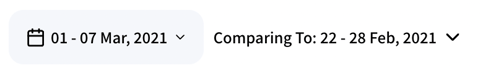
Let's say you selected the last week in the date filter...
When looking at volume, we can see that Request Discount was mentioned in 220 tickets in the last week and this was a 122% increase in ticket volume from the previous week (22/02/21 - 28/02/21).
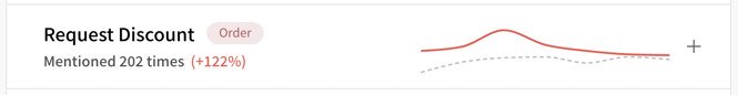
When changing the Metric to CPO, we can see that the CPO for Request Discount was at 0.09% for the week selected, and this was a 125% increase in CPO from the previous week. The CPO line is red because there was an increase from the previous date range (the previous week).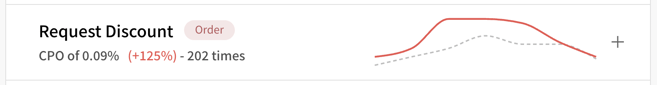
Note: Red line indicates selected week and dotted grey line indicates the week it is compared to
Historical Trend Charts
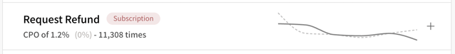
In this example, if we only saw the last two data points, we would think a 25% increase is sizeable and might need investigating. However, because the graph shows the last 6 data points, we can see "Request Refund" has decreased consistently over the last few days, so the recent 25% increase is smaller in context.
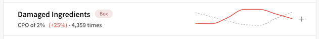
Here, the red line represents the daily trend for the selected date range. The grey dotted line represents the previous 6 days so that we can understand the daily trend comparison for two weeks. See the example below; note the dates on the detailed chart.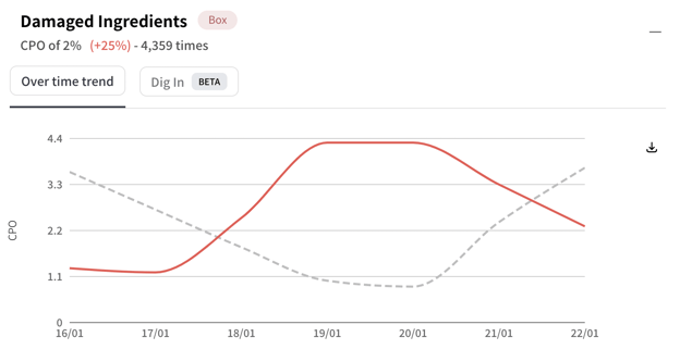
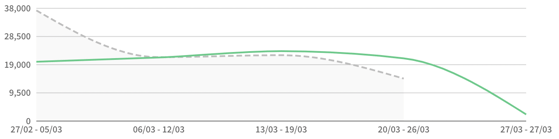
When we select the entire month, the chart changes like so, with the greyed line representing previous 28-day blocks pointing the weekly and daily trend as required and set:
Selected and Compared Date Range: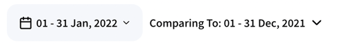
Graph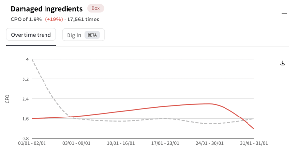
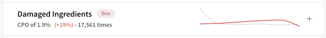
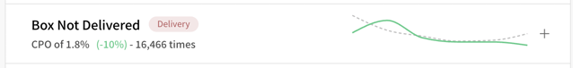
CPO Line - green, red, grey
When the latest change is an increase, the CPO line is red because CPO increases usually have negative consequences.
When the latest is a decrease, the CPO line is green because CPO decreases usually have positive consequences.
When there has been no change since the previous time period, the CPO line is grey.