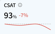
Your SentiSum CSAT dashboard is designed to highlight reasons why your CSAT score has increased or decreased.
CSAT Metrics
If using Zendesk, CSAT ratings will show as a percentage, taken from the ratings of all survey responses (even those without written responses):
CSAT (%) = (No. of 'Good' Ratings / No. of Overall Ratings) * 100
Sentiment is also shown as a percentage and based on only the written responses to CSAT:
Sentiment (%) = (No. of Positive Mentions / No. of Overall Mentions) * 100
CSAT Charts
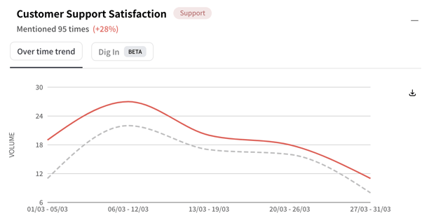
When looking at the chart for a particular AI tag such as Customer Support Satisfaction, you will see the volume of CSAT responses that mentioned Customer Support Satisfaction as shown by the red line.
Here, when we look at the last month, we can see that there were 95 CSAT responses that mentioned Customer Support Satisfaction, and 28% of them were positive mentions.![]()
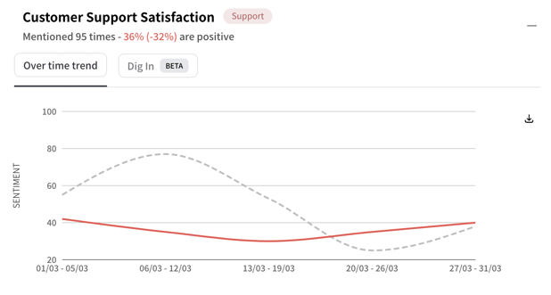
And, when we change the Metric to "Sentiment" .You will also see the sentiment of all the mentions of Customer Support Satisfaction as shown below.Then we can see that 20% of the sentiments are positive . Also, the sentiment of Website Usability also decreased by -17 compared to the previous week.
![]()
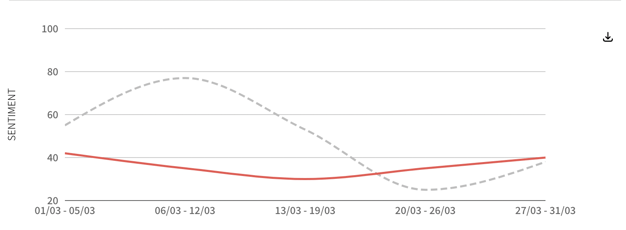
Historical Trend Charts
The example demonstrates how selecting the latest week of data is shown in the graph while the trends of the previous 4 weeks are also visible. This enables a comparison of recent changes within a longer-term context.
For example, this sentiment decrease of -32 might not seem too serious. However, looking at the historical trend over the last 5 time periods, we can see the Customer Support Satisfaction sentiment has decreased steadily over the last 4 months and could indicate a more significant problem.
Sentiment Line - Green, Grey, Red
When the latest change is an increase, the sentiment line is green because sentiment increases usually have positive consequences.
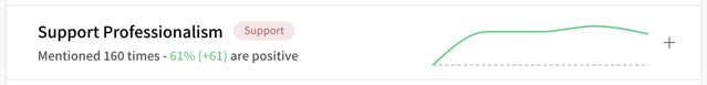
When there has been no change since the previous time period, the sentiment line is grey.
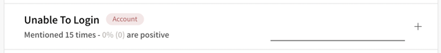
When the latest change is a decrease, the sentiment line is red because sentiment decreases usually have negative consequences.