
From today we are bringing you more flexibility in your charts.
Do you want to see the hourly breakdown of support tickets in the last day? And compare performance to the same day last week? Or see your weekly sentiment over the past few months? Now it's possible!

More advice is on it's way but here are the main points to get you started:
1 - No more historical trends, you will only see the date ranges you select at the top of the page in your chart.
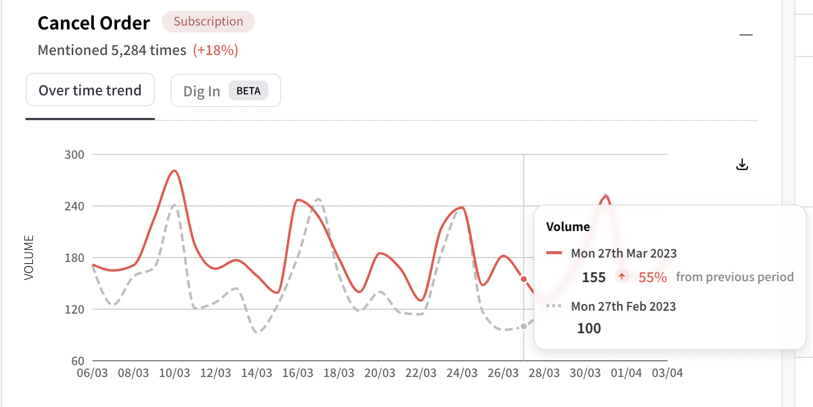
2 - You will always see the current performance line, and the past performance line (grey dotted).
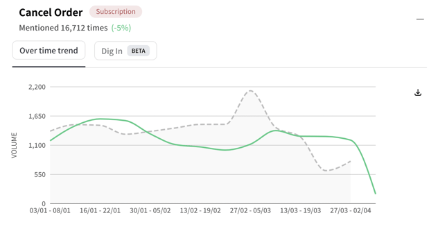
3 - You can change the granularity of your chart intervals (hourly, daily, weekly, monthly). Weekly is shown below.
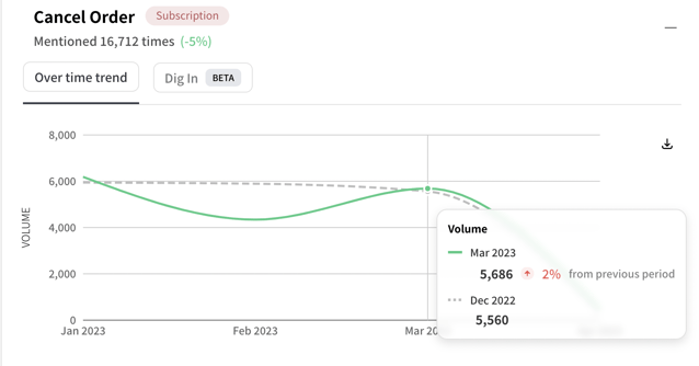
4 - You can also change what data to compare it to (default, previous day, previous week, previous month). Default will try to match to the most useful day or week comparison. Try it out
We have also changed
-
Summary page. Small changes have been made to help with a clearer understanding of the metrics shown.
-
Conversations in Discover. We wanted to give you more space for your analysis, but also a comfortable place to view responses and conversations. When you click on a conversation, it will now pop-up replacing the list of conversations. To exit, you can hit Esc or press the X button on the top right.
Do get in touch if you have any questions, or would like some guidance on how best to utilise these new charts! The default options should work well for most circumstances, but do let us know if you get stuck and we'll be more than happy to help!
Happy charting!
The SentiSum Team ✌🏼